|
|
 PowerPoint
Slide Styles PowerPoint
Slide Styles
|
|
|
PowerPoint offers a lot of style templates to start out
with - and the sheer number of styles can be
intimidating! However, not all styles are created
equal. There are some good rules of thumb to use
when picking or creating a style, to keep the audience
happy, visually pleased, and not confused. So here
we go...
-
Colors - When choosing colors
in PowerPoint slides, the key is CONTRAST.
Whether it's a dark or a light background, make it
pretty darn dark or light - and make the text pretty
darn opposite. Some colors can be tricky - if
you want red, don't use pure red, but instead a darker
or lighter red, depending on the situation.
Studies show that the most popular PowerPoint style is
a dark blue background with light yellow text, by the
way. Huh. One more thing - a good way to
use colors tastefully is to LIMIT the number of colors
involved. Sure, use a different color for
emphasis, for example - but only ONE other
color. Once your slide looks like a rainbow, you
look like a fool!
-
Text - There should never be
that much text on a PowerPoint slide, but let's make
sure that whatever text there is looks good.
Other than the contrast mentioned above, make the text
large enough to see (at least 24-point) and a legible
font (non-serif fonts like Arial tend to read
best). Finally, I'd like to suggest a rule of
thumb for all you bullet-point-list people out
there: 6x6. That is, have NO MORE than 6
lines of text on a slide, and NO MORE than 6 words per
line.
-
Standardize - Whatever style
you choose, make sure it stays the same across all the
slides! Consistent titling, coloring, fonts,
capitalization, logos in the corners, etc. You'd
be surprised how much this rule is violated. To
help, try exploring the "master slide"
feature in PowerPoint - it can automatically
standardize any style changes across all slides.
Very useful! Enjoy.
-
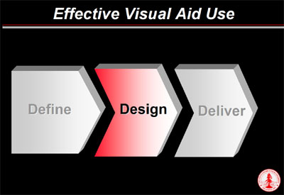
Navigation - It can help your
audience to "know where they are" in your
speech; so, when moving from one section to
another, go back to a "map" of the speech,
and update them on where they are. The slide
below, for example, might be in between the
"Define" and "Design" sections of
a speech; the audience then knows that the
"Design" section is what's about to be done,
and that "Deliver" will come after
that.
Now that you know
how to make your slides look good, what should you put in
them, and how? Let's find out - move on to Content...
|